In my post about real-time analysis I shared a screenshot of part of Etsy’s deployment dashboard. This is the dashboard that every engineer watches as he or she pushes code to production. A bunch of alert readers noticed some odd things about it:
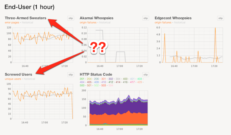
The screenshot is not doctored, so yes we do graph “Three-Armed Sweaters” and “Screwed Users.” I can explain. In fact, I can give you excruciating detail about it, if you’re interested! Here goes.
“Three-Armed Sweaters” refers to our error pages, which feature one of my favorite drawings in the world. It was done by Anda Corrie:

So the graph on the dashboard is just counting the number of times this page is shown. But in order to reduce the frequency of false alarms, the graph is actually based on requests to an image beacon hidden on the page. This excludes most crawlers and vulnerability scanners. Those constituencies have a habit of generating thousands of errors when nothing is malfunctioning. But lucky for us, they almost never waste bandwidth on images.
Now, there are many reasons why Etsy might not be working, and they don’t all result in our machines serving a sweater page. If our CDN provider can’t reach our production network, it will show an error page of its own instead. In these cases, our infrastructure may not even be seeing the requests. But we can still graph these errors by situating their image beacon on a wholly separate set of web machines.
The “screwed users” graph is the union of all of these conditions. So-called, presumably, because all of this nuance is relatively meaningless to outsiders. “Screwed users” also attempts to only count unique visitors over a trailing interval. This has the nice property of causing the screwed users and sweaters graphs to diverge in the event that a single person is generating a lot of errors. The internet, after all, is full of weird people who occasionally do weird things with scripts and browsers.
You now know exactly as much as I do about the graphing of web errors in real time. I assume that this is a tiny fraction of the world’s total knowledge pertaining to the graphing of web errors in real time. So you would be ill-advised to claim expert status on the basis of grasping everything I have explained here.
By the way, most of the software Etsy uses to produce these graphs is freely available. Here’s StatsD and Logster.