|
Hi my name’s Dan McKinley. This is a reprise of a talk I gave for designers last month. # |

|
If anyone stumbled in off the street you’re at Etsy # |

|
Etsy is the world’s handmade and vintage marketplace. # |
|
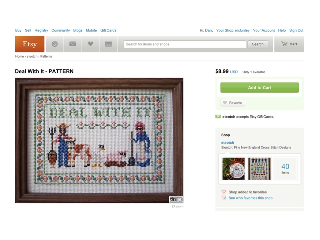
Etsy’s a place where you can buy all kinds of things, including handmade crafts like this sampler # |
|
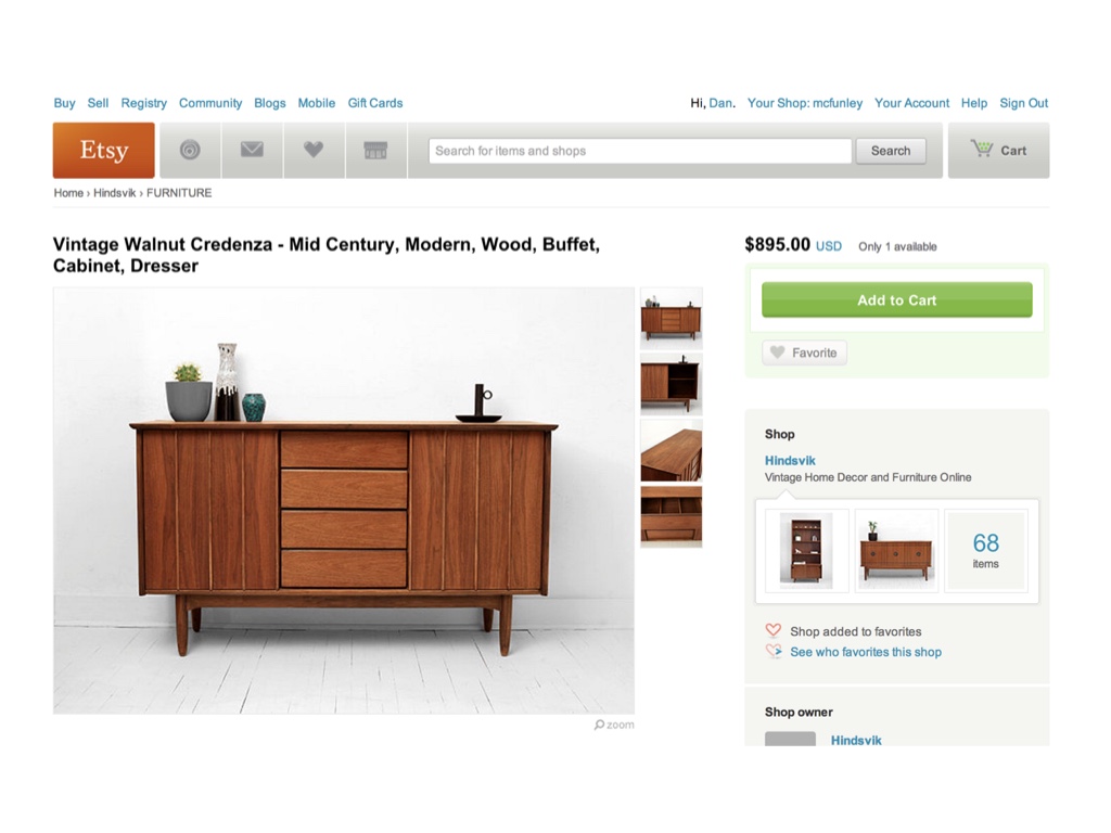
... or this vintage credenza ... # |
|
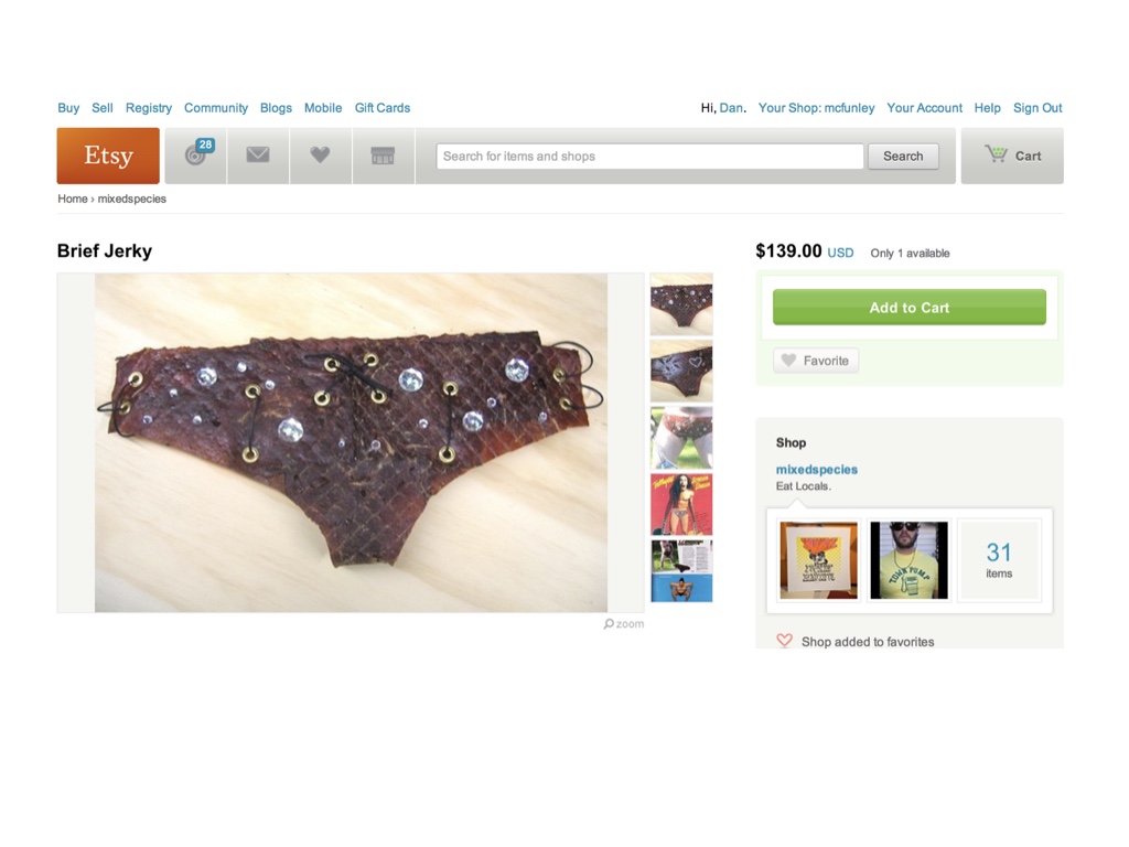
... and rhinestone-studded underwear made of beef jerky ... # |
|
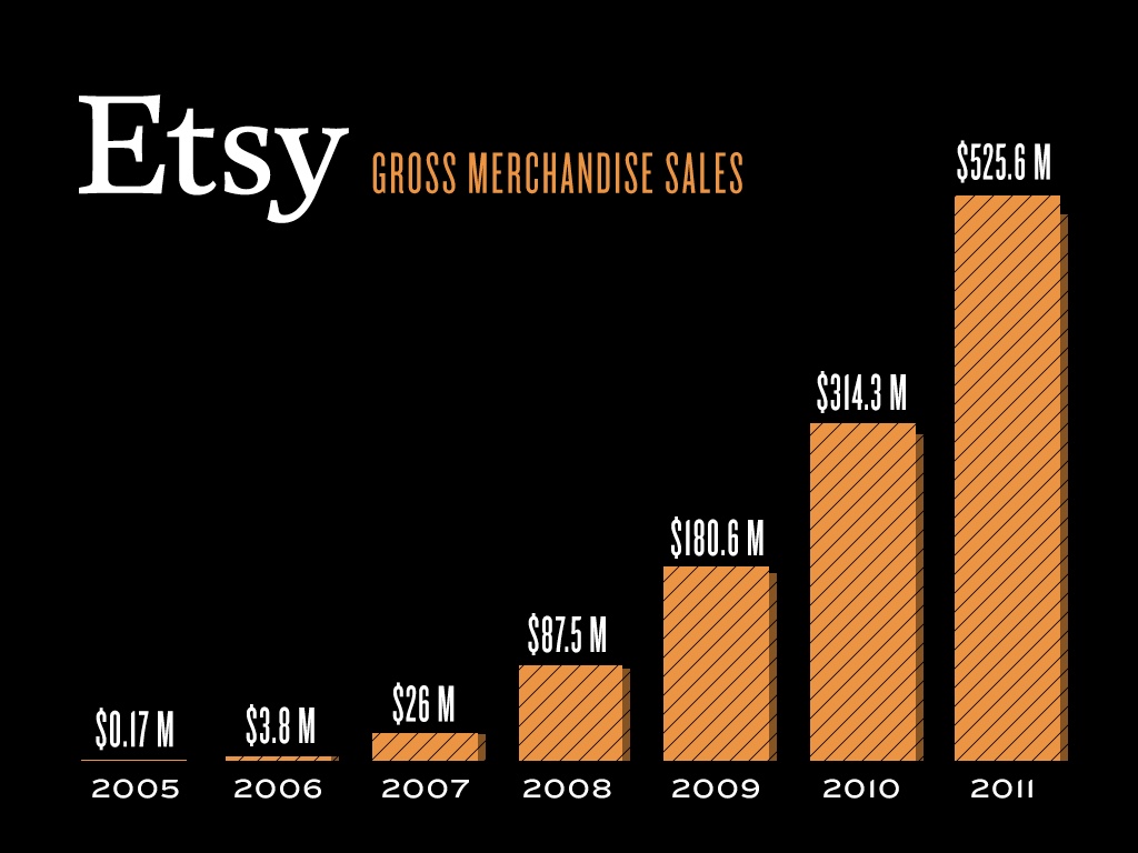
Beef jerky underwear is reasonably popular apparently. we’re on track to sell between $800MM and 900MM in goods this year. This makes us about as big as Hot Topic. # |
|
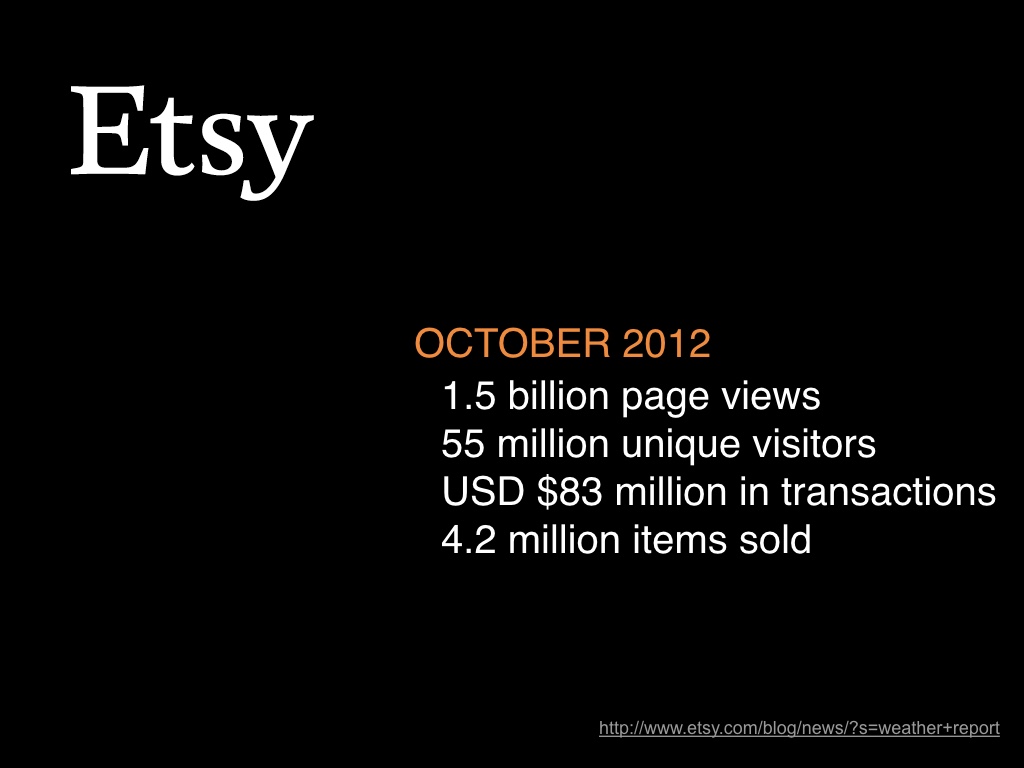
We had about 1.5B page views in October which makes us a reasonably large website. # |
|
At Etsy, we love experiments and A/B testing. And that’s the main thing I want to talk about today. # |
|
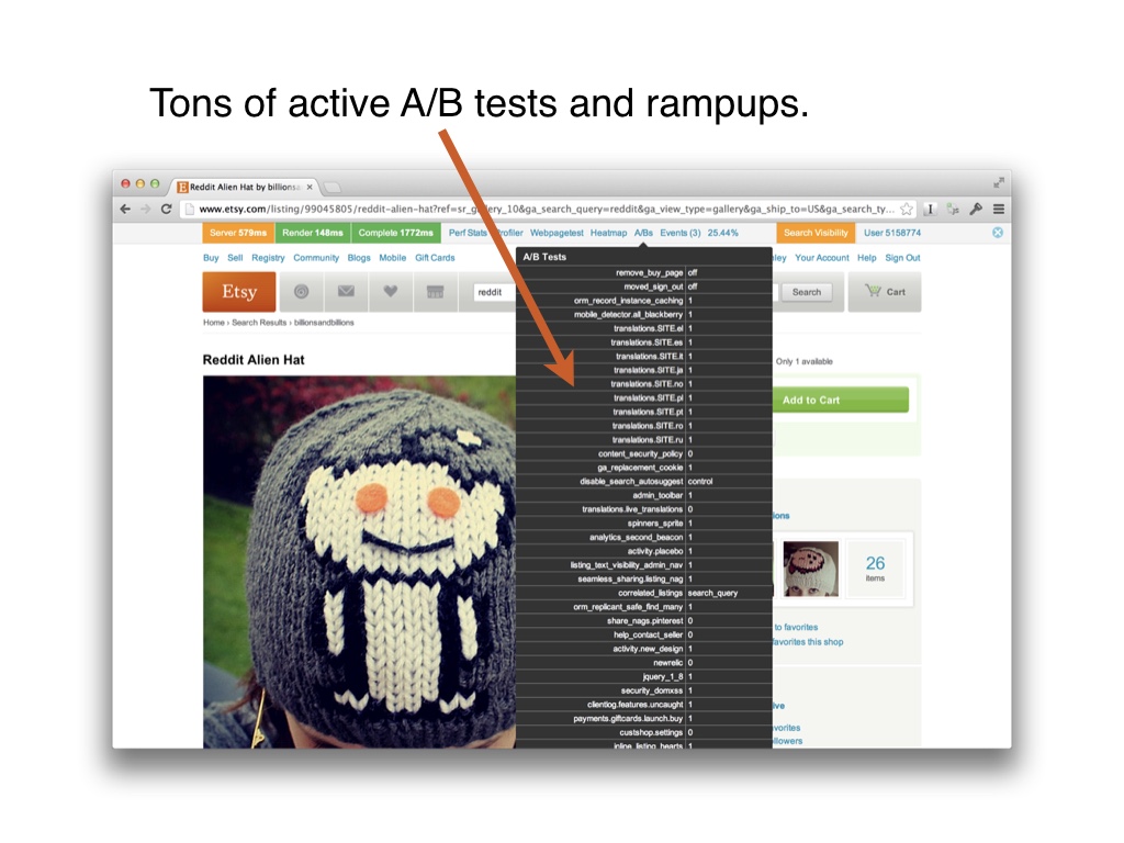
Here’s a screenshot of an internal view of the various tests and config rampups running on just one of our pages. As you can see, there are a whole lot of them. # |
|
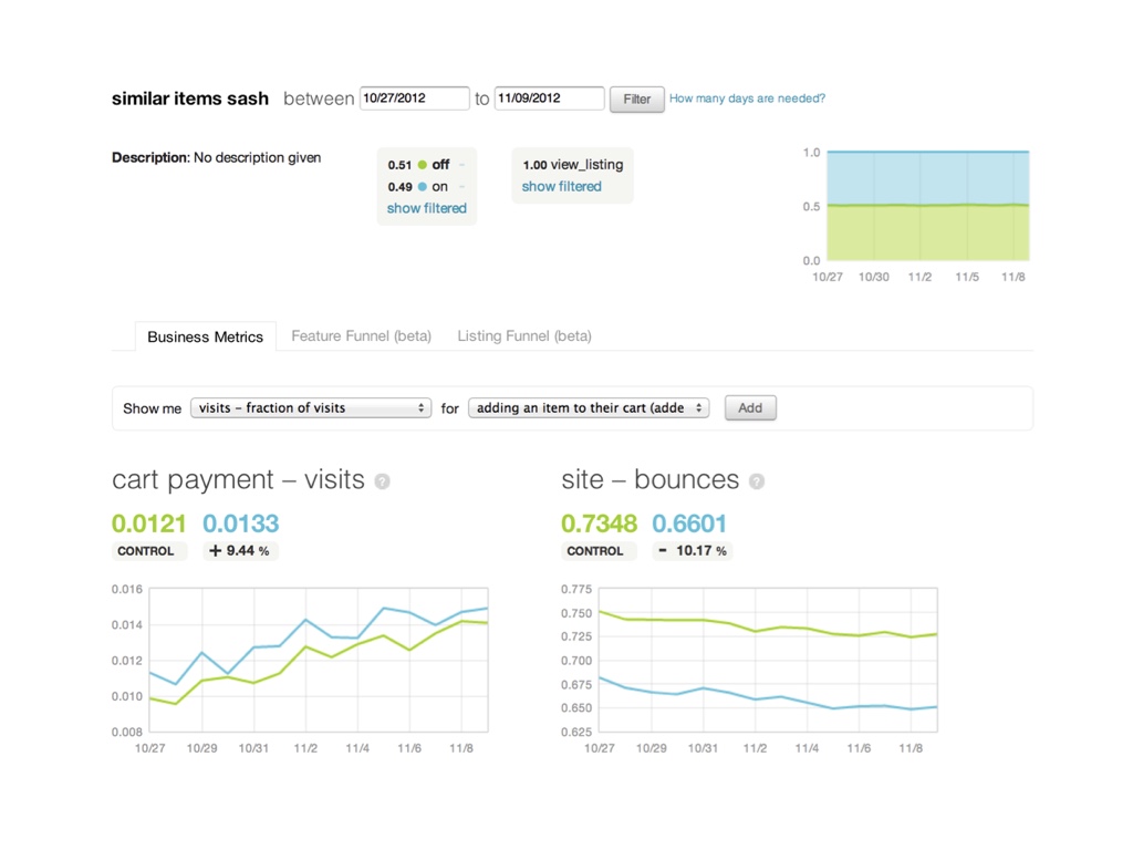
We’ve invested plenty of time and effort into tooling to support this work. This is a screenshot of our A/B analyzer, which automatically generates a dashboard with important business metrics for every configured test. # |
|
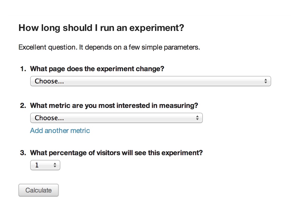
We’ve built tools that protect us from some gnarly statistics. This wizard does the math for you and lets you know how long an experiment will need to run in order to have a significant result. # |
|
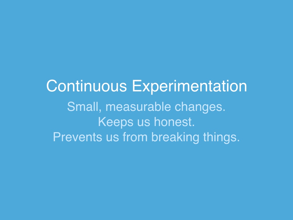
I’m going to call what we do “continuous experimentation,” for the lack of a better term. We try to make small changes as much as possible, and we measure those changes so that we stay honest and don’t break the site. # |
|
So what do I mean by “breaking the site?” Well, behind every Etsy shop is a person that depends on it, and counts on us not to push changes that hurt their business. So we would be remiss not to measure our changes. # |
|
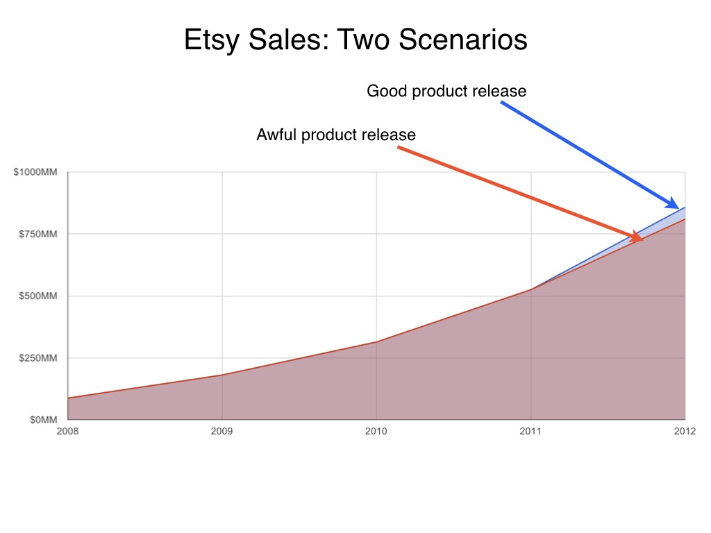
The second reason we measure product releases is so that we stay honest. Much of Etsy’s sales are seller-driven, so our graphs currently tend to go up no matter what. Obviously that can’t continue forever. But we have to use A/B testing to tell if we’ve made things worse or better. # |
|
# |
|
# |
|
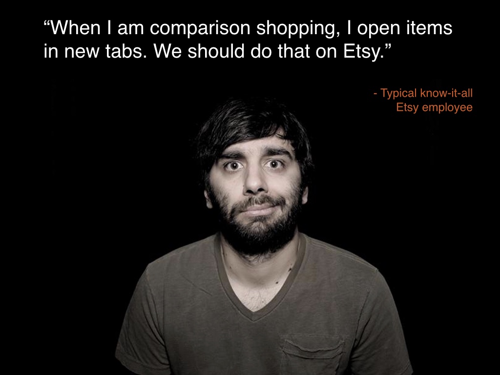
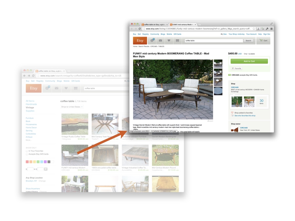
Let me give you an example. A few years ago there was controversy internally at Etsy over whether or not items should open up in new tabs. Some Etsy employees do this themselves when they’re digging through search results, and they wish that it happened by default. They thought that the average user would be happier if this were the case. # |
|
So we eventually stopped arguing about this and just tried it. We ran an A/B test that opened up items in new tabs. # |
|
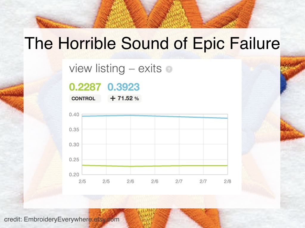
When we tried that, 70% more people gave up and left the site after getting a new tab. Maybe some Etsy employees know how to use tabs in a browser, but my grandmother doesn’t. We’ve replicated this result more than once. # |

|
Surprise! We don’t argue about that anymore. # |

|
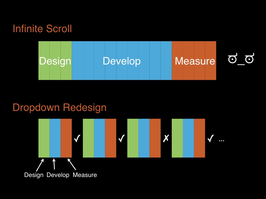
We’ve been at this for a while and one of the main things we’ve learned from this, which is the main thing I want to talk about today, # |
|
is that process has to change to accommodate data and experimentation. If you follow a waterfall process and try to bolt A/B testing onto it, you will fail # |
|
to illustrate this I want to go through two projects that we’ve done # |
|
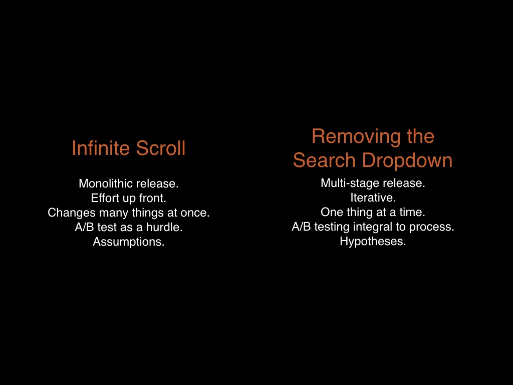
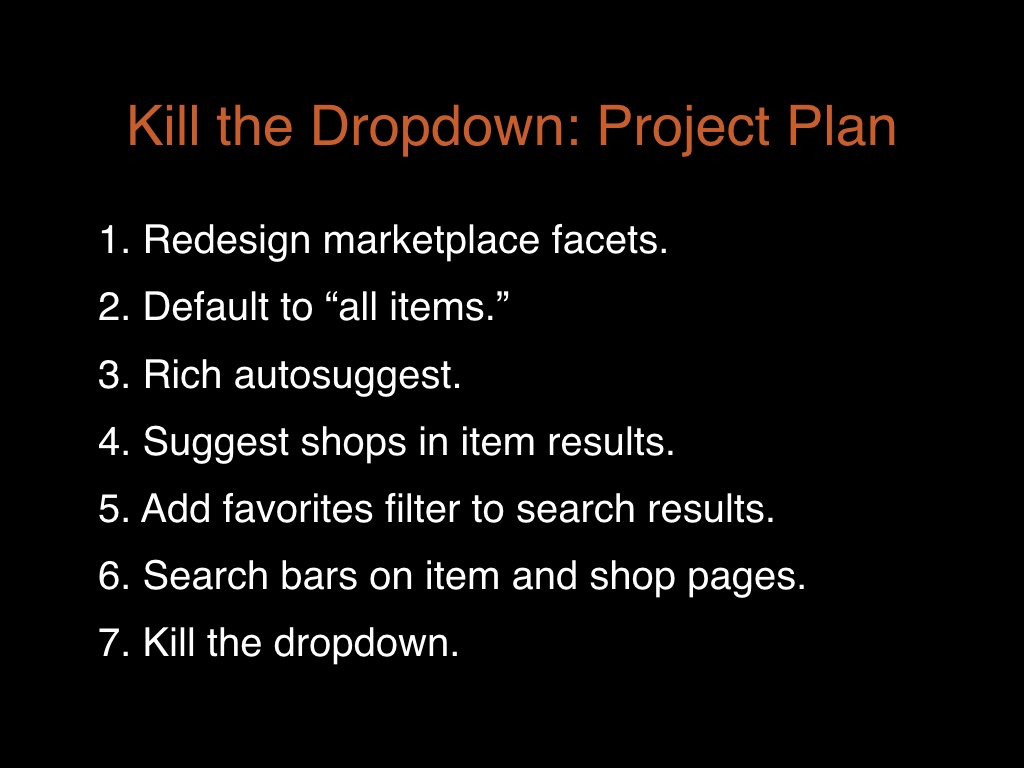
These were two projects done largely by the same team. Infinite scroll was poorly managed, and a release removing a dropdown in our site header was well managed. # |

|
First I’ll go through our deployment of infinite scroll in search results. # |
|
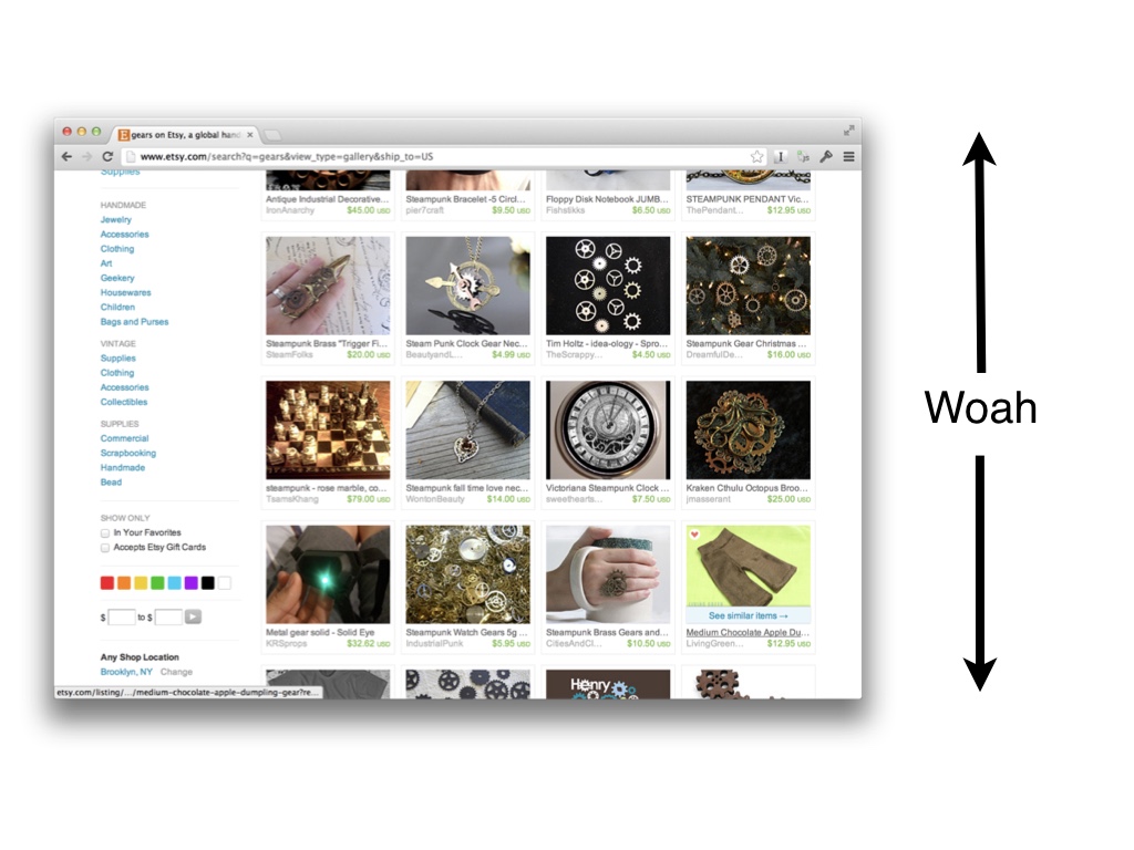
If anyone doesn’t know what I mean by infinite scroll: I mean that we changed search results so that as you scroll down, more items load in, indefinitely. # |
|
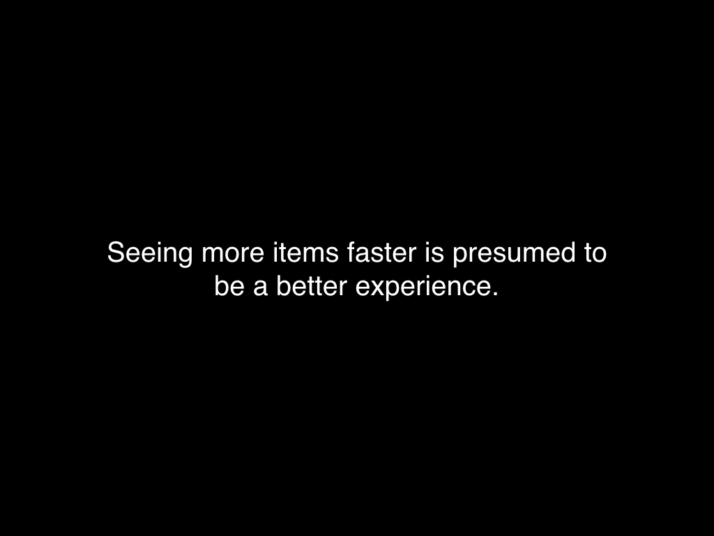
The reason we did this was because we thought that it obvious that more items, faster was a better experience. There’s a lot of web lore out there to that effect, based mostly on some findings Google’s made in their own search. # |
|
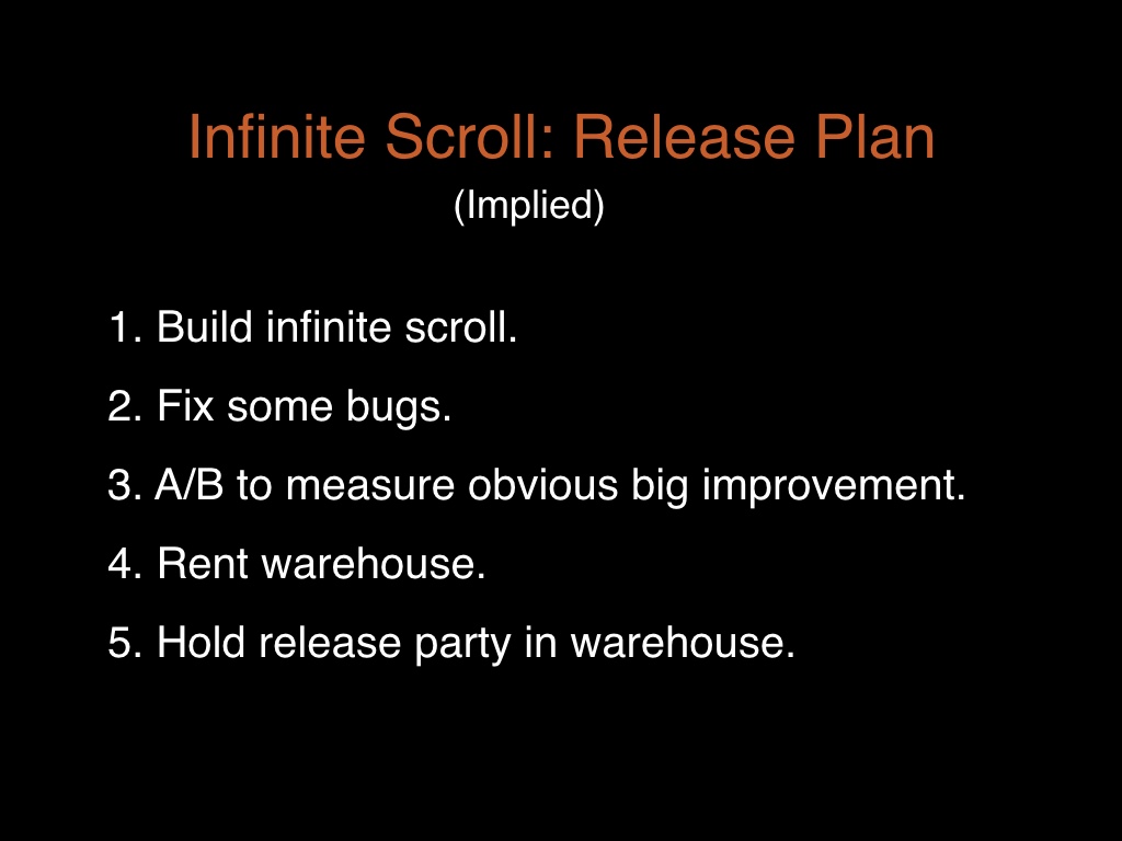
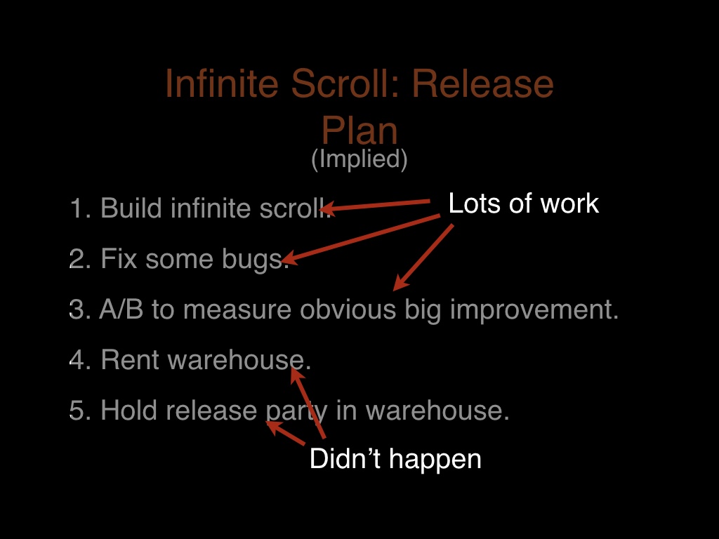
So when we decided to do this we just went for it. We designed and built the feature, and then we figured we’d release it and it’d be great. # |

|
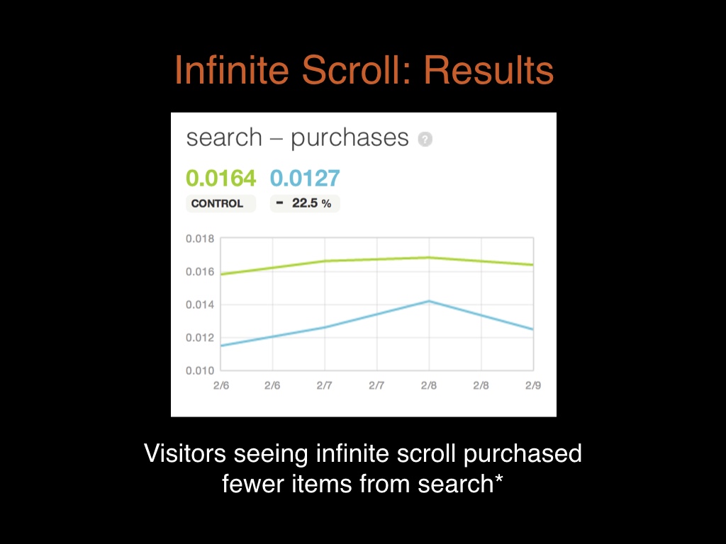
so the results, # |
|
not to spoil the surprise, were not what we were expecting. # |
|
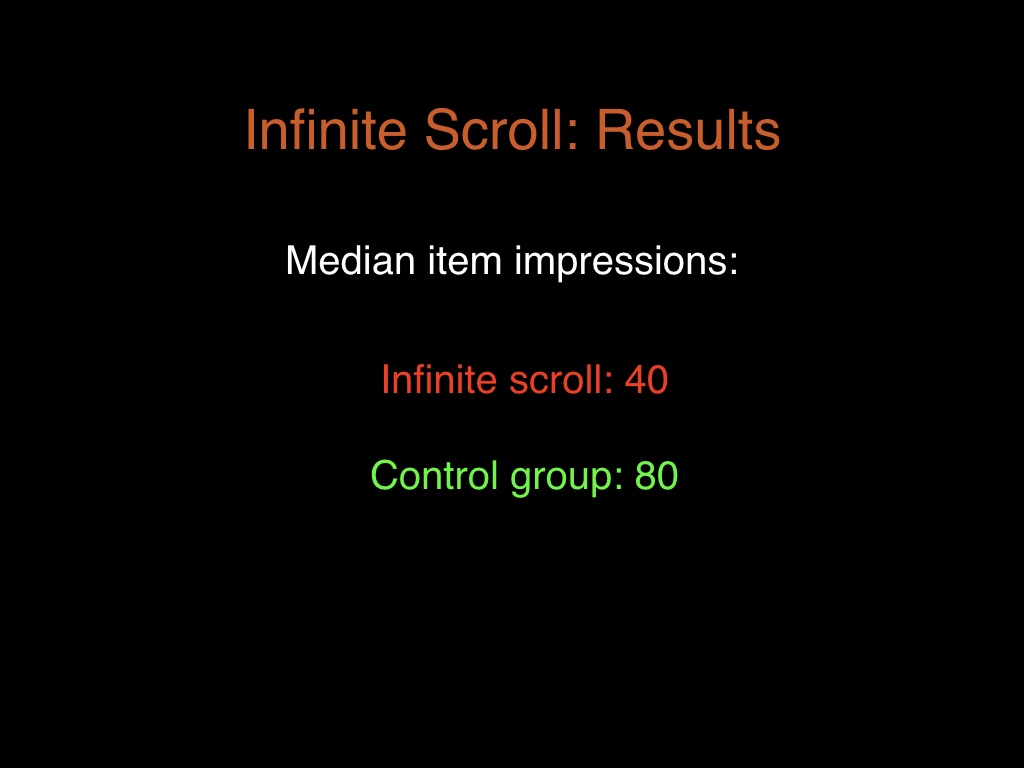
People who had infinite scroll saw fewer items in search results than people in the control group, not more. # |
|
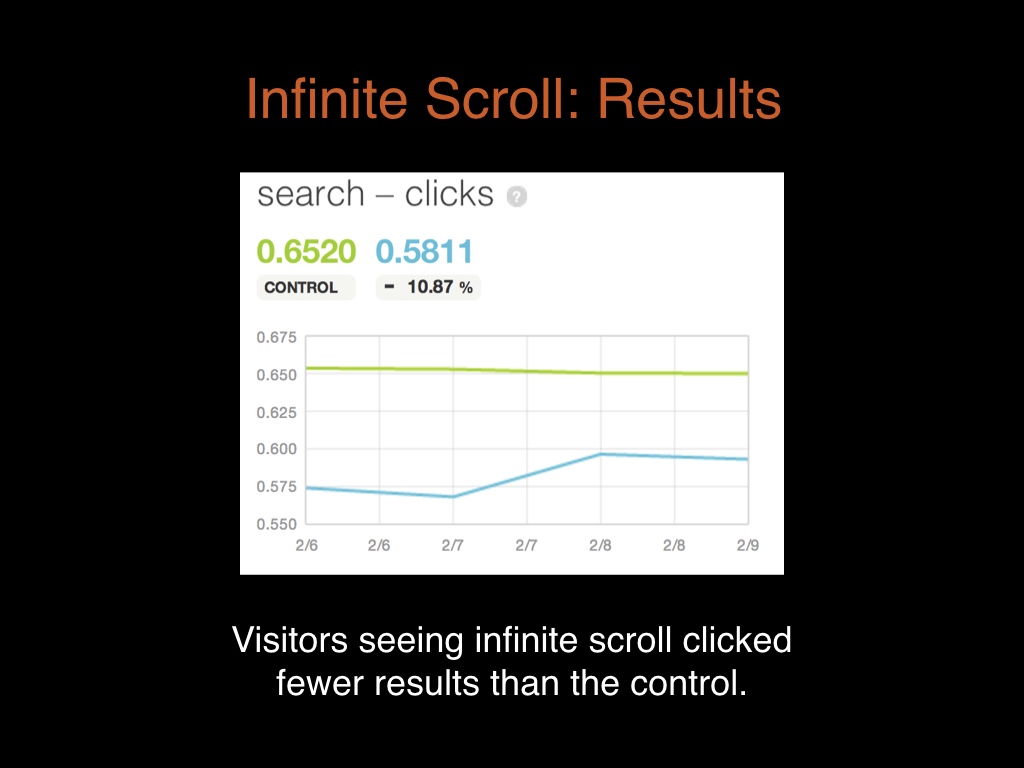
they clicked on fewer items. # |
|
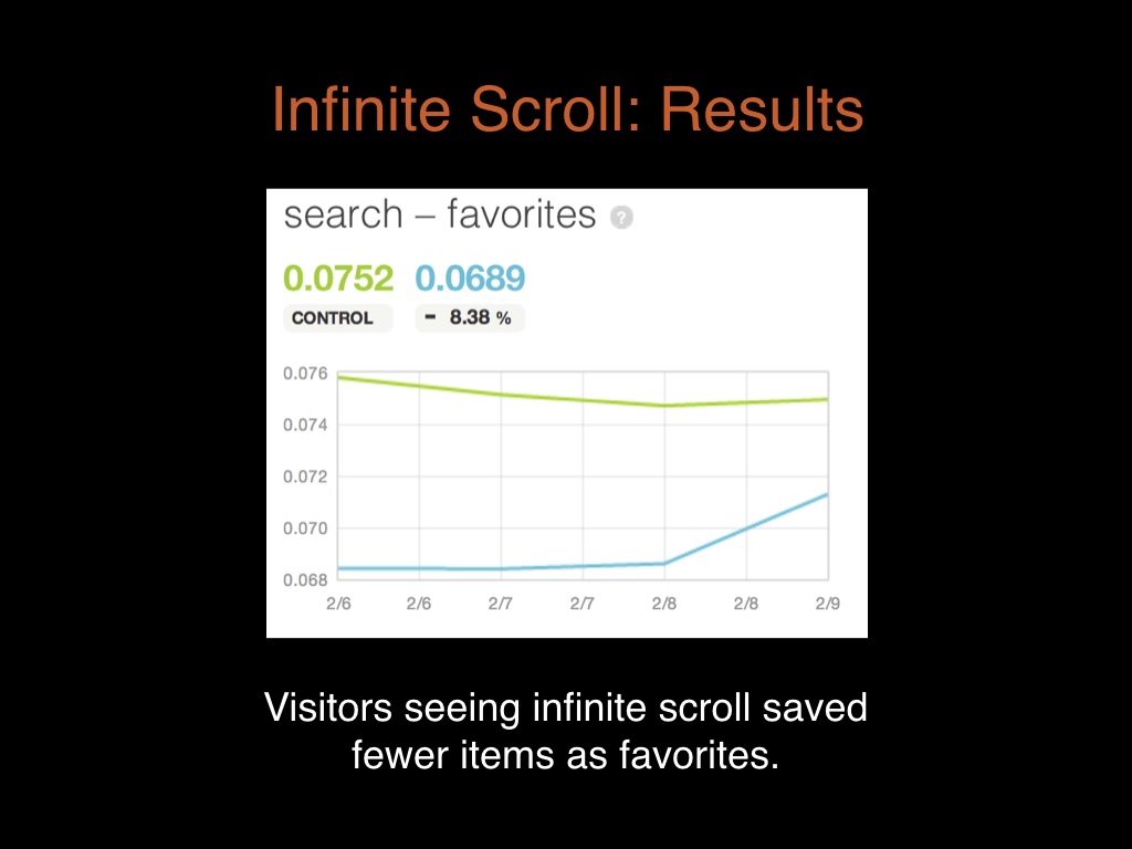
they saved fewer items as favorites. # |
|
They bought fewer items from search. Now they didn’t buy fewer items overall, they just stopped using search to find those items. Which is kind of interesting. It was clear we’d made search worse. # |
|
The first thing that occurred to us is that there must have been bugs in the product that we missed. So we spent a month trying to figure out if that was the case. We sliced results by browser and geographic location. We sent a guy to a public library to try using an ancient computer. We did find some bugs, but none of them changed the overall results. # |
|
Eventually we came to terms with the fact that infinite scroll had made the product worse, and we had changed too many things in the process to have any clue which was the culprit. # |
|
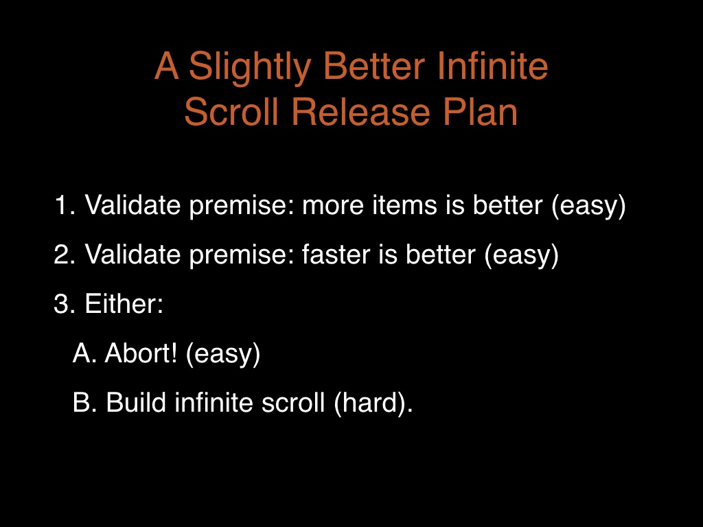
So, we were in a situation where we weren’t sure if we should continue working on this or not. Even if we had issues in IE or something, the behavior of people using Chrome wasn’t way better, it was also worse. How do we know if it’s a good idea to finish this or not? So we went back and tried to verify that the premises that made us do this were right. # |
|
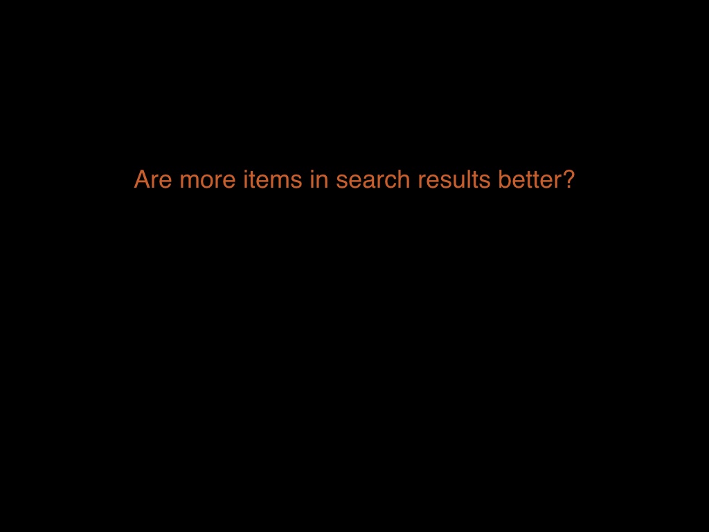
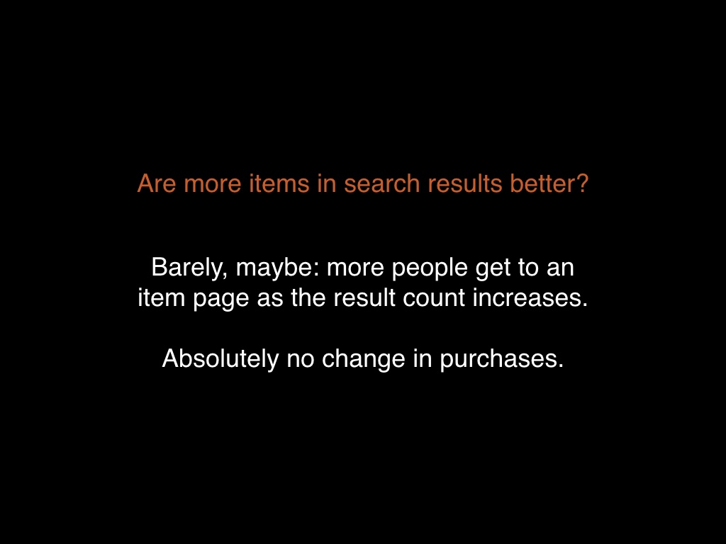
First of all, is it true that more items is better? # |
|
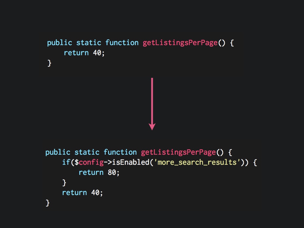
We ran a test where we just varied the number of results in normal search results. # |
|
And the answer was yes, maybe a little bit, but only barely. There was a very slight improvement in the number of people that ever got to a item page. But the effect is very slight, and purchases aren’t sensitive to this. There’s no increase in purchases when we increase the number of search results. # |
|
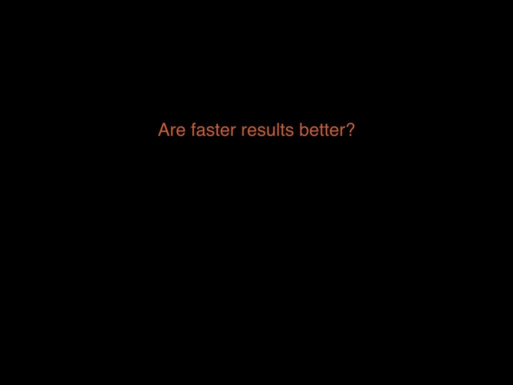
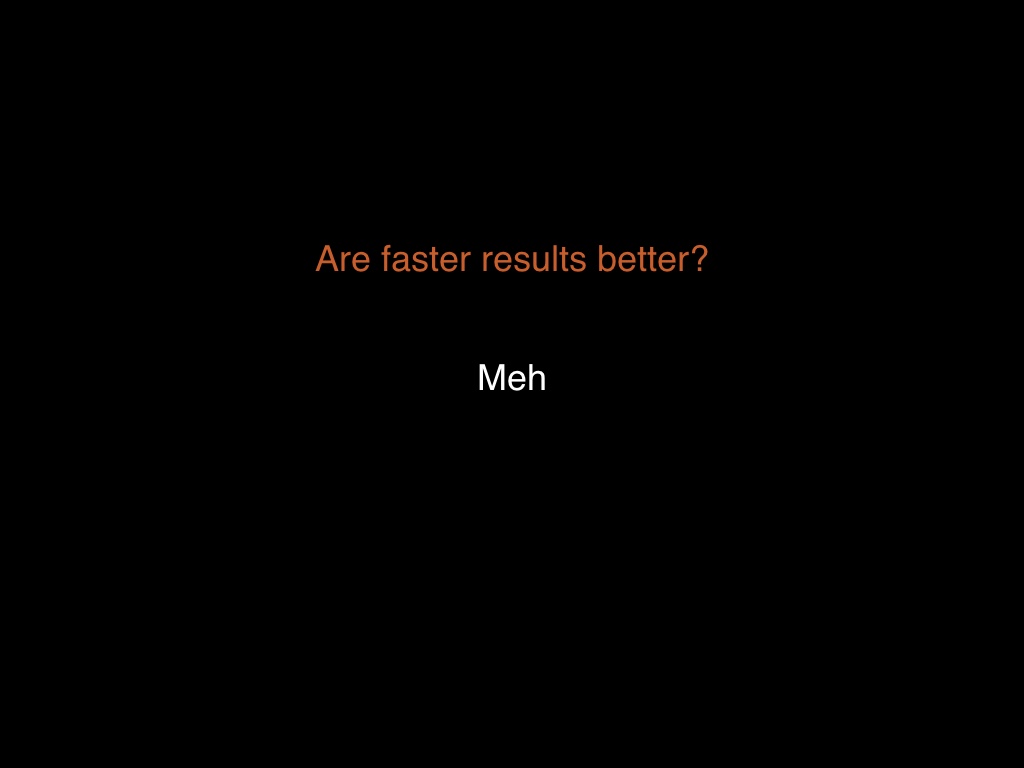
The other major premise was that faster search results would stop people from getting bored, and they’d buy more as a result. # |
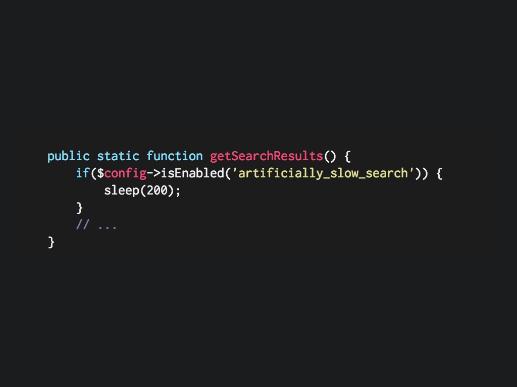
|
We ran a test where we slowed down search artificially, by adding sleeps(). # |
|
Absolutely nothing happened. Which isn’t to say that performance is pointless, but people buying items don’t seem to be sensitive to performance at all. # |

|
In the end the expected benefits to infinite scroll just didn’t seem to be there. Our premises were wrong. So we took infinite scroll out back and we shot it. # |
|
So if we go back to our “product plan,” we see a couple of major things wrong with it. We did a lot of work, and it was pointless. # |
|
A better way to have done this would have been to validate those premises ahead of time and then make the call. But we didn’t do that. # |
|
Throwing out work feels really horrible. Most of the time this is a really difficult choice to make, and without a lot of honesty and discipline, most teams aren’t going to do it. We are not very rational creatures in the face of sunk costs. # |

|
My point is not that infinite scroll is stupid. It may be great on your website. But we should have done a better job of understanding the people using our website. # |
|
So that was a bad release. I want to change gears now and go through a good one. # |
|
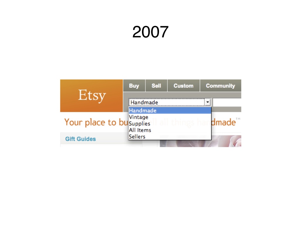
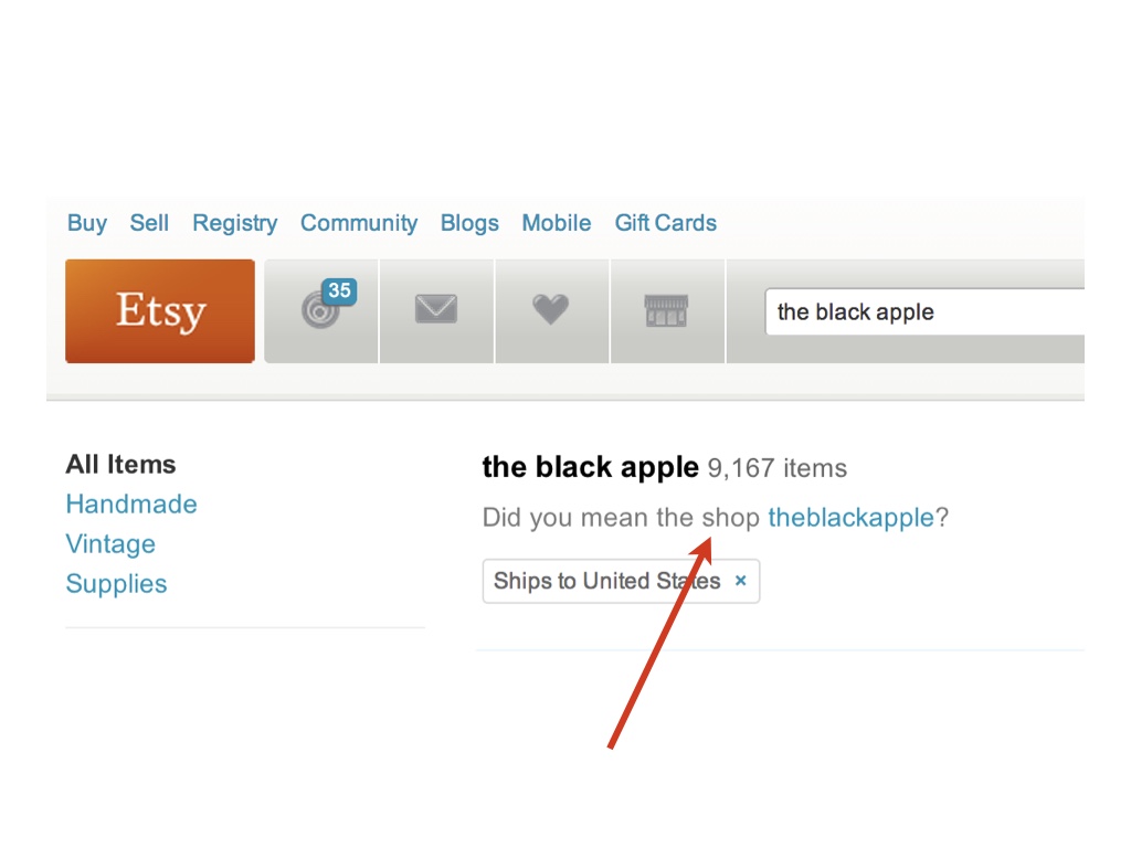
Pretty early on, we added this dropdown to the header, mainly to pick between handmade items and vintage items. It wasn’t intended to be permanent. # |
|
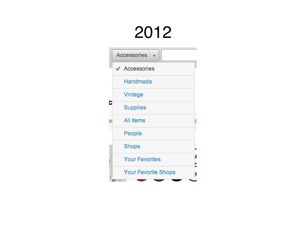
But as these things always do, it got way out of hand. It looked like this five years later. # |
|
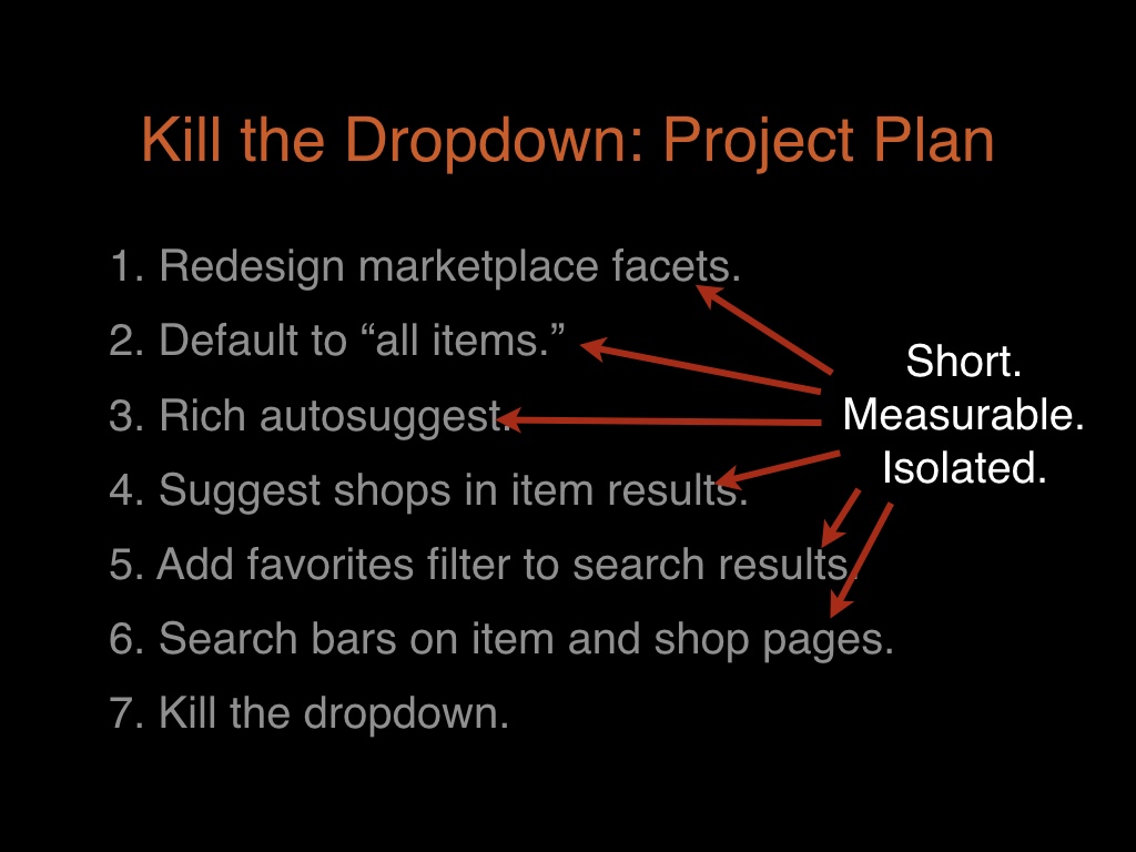
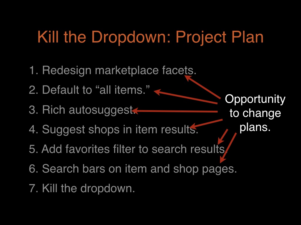
So we wanted to remove this thing. Chastened by the infinite scroll release, we did our best to plan this out in smaller steps. # |
|
Each of these steps is small and isolated. # |
|
Each step is an opportunity to get real feedback and change directions if we have to. # |
|
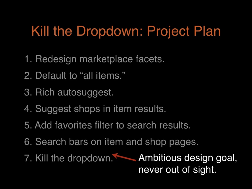
And all of the individual releases were small, but the overall design goal was still ambitious. # |
|
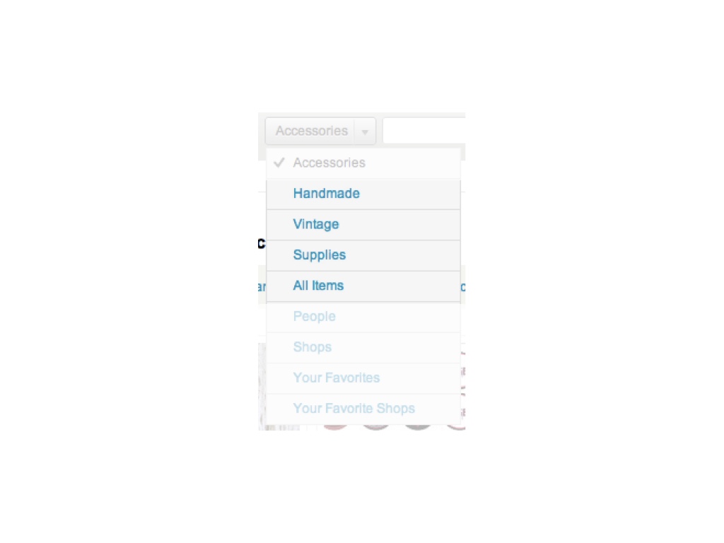
So, the first thing we had to address was the fact that the dropdown was used to cut the marketplace by different item types. # |
|
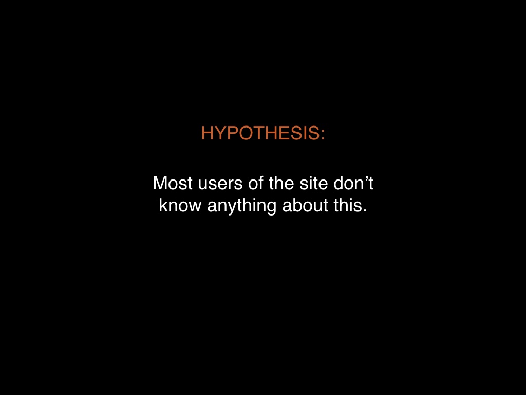
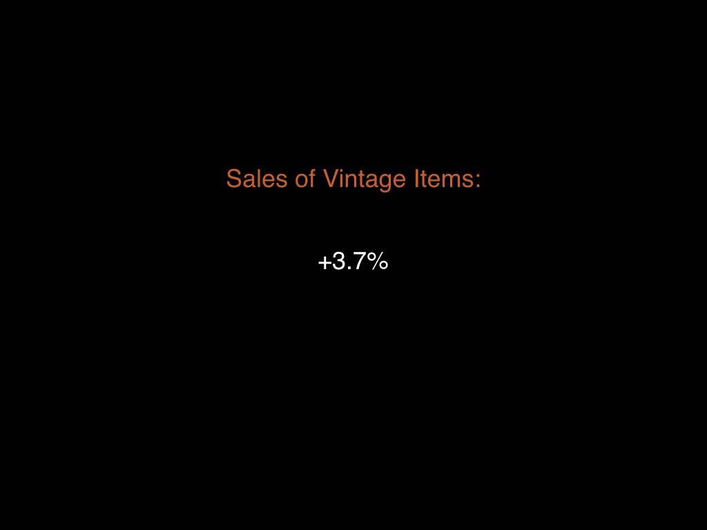
We were working from a hypothesis that most people using Etsy don’t even notice this. But again, we had to verify this. # |
|
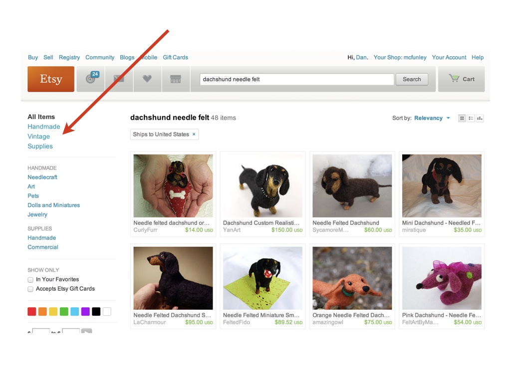
First we introduced this faceting on the left side of search results, and made it more obvious. This relatively simple and it was an improvement over the old design that nobody used. # |
|
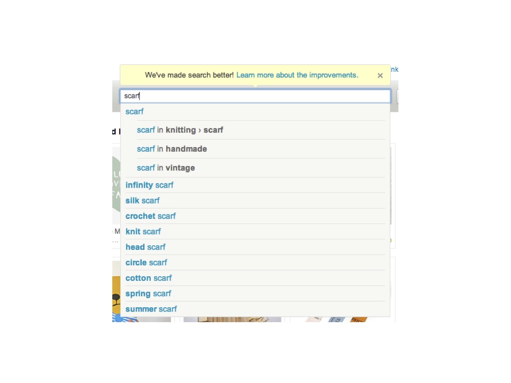
But still, relatively few people noticed that. So we also built faceting into our autosuggest. We made it possible to drill down into categories as you typed. # |
|
After we did this, sales of vintage items without the dropdown in place increased almost 4%. So we increased the ability of buyers on Etsy to find vintage goods, we didn’t decrease it. Which is a great thing to be able to tell our community. # |
|
So we were right. Most people using the site in fact did not know how to use the dropdown for this. # |
|
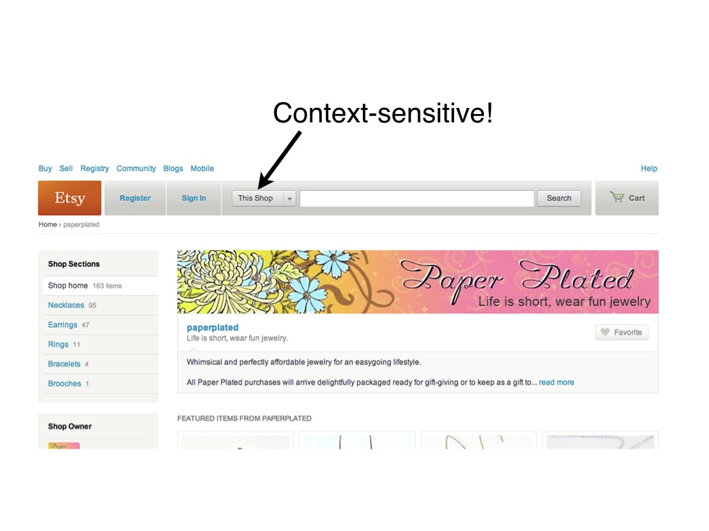
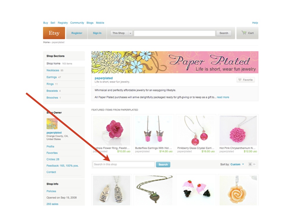
Another horrible behavior of the search dropdown was that it was context-sensitive. So if you were on a shop page it defaulted to searching within the shop. And in some other situations it would search for people. # |
|
So again, we figured that this was too complicated and nobody realized what was happening. # |
|
To contend with this we introduced a secondary search box on shop pages so that people could do a search scoped to just the shop. This worked a lot better. # |
|
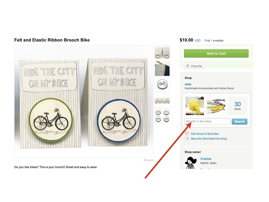
We also tried adding this search bar to the item page. But few people used it and those who did performed very poorly. # |
|
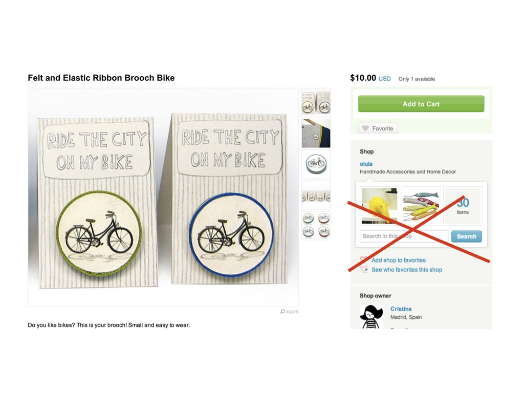
So we took that part out. If we had done the whole project all at once, we probably would not have noticed that this detail sucked. # |
|
Another thing the search dropdown could be used for was searching for shops. Nobody used it. # |
|
So we added shops suggestions to item results and made sure more people could find shops # |
|
So you more or less get the idea here. We had a big goal, which we could have been unmanageable as a single release. We did it as ten or fifteen small releases. # |
|
# |
|
Contrasting the two release plans, infinite scroll was a big bet that didn’t work out. The dropdown redesign was a series of small bets: some worked and some didn’t, but we didn’t have to throw out everything when things didn’t work # |

|
I want to leave you with some parting advice. # |
|
Experiment with a minimal version first. With infinite scroll, we should have verified the premises. # |

|
Plan on being wrong. If you measure, you’ll encounter many counterintuitive results. # |
|
# |
|
This is not always going to work: you may still have to make big bets on big redesigns sometimes. # |

|
But if you’re throwing this card down all the time you’re probably doing it wrong # |
|
thanks # |